Rebrand Santa Ana - brand identity designer

Santa Ana Rebranding

Rebrand for an educational institution with more than 20 years of experience.

The “Santa Ana Mixed Private School” had the mission of transforming its business, achieving the highest standards of educational quality, sustainability and family experiences in the academy. The time had come for its visual identity to reflect the rest of the changes that the school will undergo for future generations.

Table of Contents

The challenge:

"El Colegio Particular Mixto Santa Ana", was attentive to how the new generations of young parents introduced their children in the process of academic training, so this educational center could not be left behind and decided to refresh its brand with a more attached approach to the change that comes in the future.

The new logo design

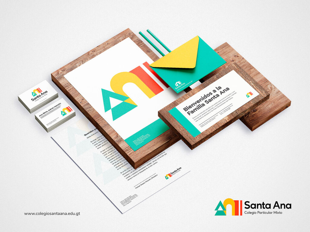
The new logo pays homage to the brand's heritage with a modern, simple and friendly design. This new design revolves around 3 key axes for the school, the ecological approach, the golden door of Santa Ana and Joaquín and the red book as a symbol of education and Santa Ana

que es la identidad de marca Diseño de Identidad de Marca - Escuela

Brand Identity

We proposed that the brand feel more modern, friendly, familiar and sustainable, without falling into the religious, but without leaving behind the history of Santa Ana. We were inspired by the symbology of Santa Ana as a biblical character from the apocryphal gospels and the paintings Renaissance that revolve around it. The new logo pays homage to the brand's heritage with a modern, simple and friendly design.

About the symbol

The symbol has 3 key elements that allowed to simplify the essence of the brand. #1 The new ecological approach of the brand, because the school wanted to pay more attention to improving and expanding its green spaces. The golden door of Santa Ana and Joaquín as part of the tradition and origins of the brand and finally the red book of Santa Ana as a symbol of education. These 3 symbols would form a flexible brand identity to identify the administrative areas, the study areas and the green areas of the school.

logo design santa ana

In Western iconography, Saint Anne can be recognized by her long, usually red, robe and cloak covering her head, often holding a red book.

"Joachim and Anna meet at the Golden Gate" is a relatively frequent theme in Christian art. Coming from a scene from the apocryphal gospels (especially from the Protoevangelium of Santiago), it is part of a series on the life of the Virgin. Saint Anne is also shown as the matriarch of the Holy Family, the extended family of Jesus, a popular theme in late medieval Germany. At this time the images of Santa Ana in a triple image were frequent, that is, Santa Ana, in her arms the Virgin Mary and in her arms the Child Jesus.

On the other hand, the new ecological and sustainable school was represented through the symbology of the tree as a sustainable and green element for green areas and the institution's recyclable methodology.

Putting together these 3 symbols, the red book of Santa Ana, the Golden door of Joaquín and Ana, and the tree, an abstraction of these 3 forms was generated that would result in the isotype of the brand. In addition to this, we were inspired by the original color palette of the Colegio Particular Mixto Santa Ana logo that features a fresco painting of Santa Ana.

The redesign

This new change in the company would inspire the redesign of the brand. As a much more modern, daring and clean educational institution but without neglecting the familiarity and tradition or the values that Santa Ana represents.

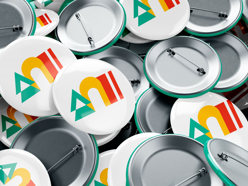
Mockup Pin Santa Ana Rebrand
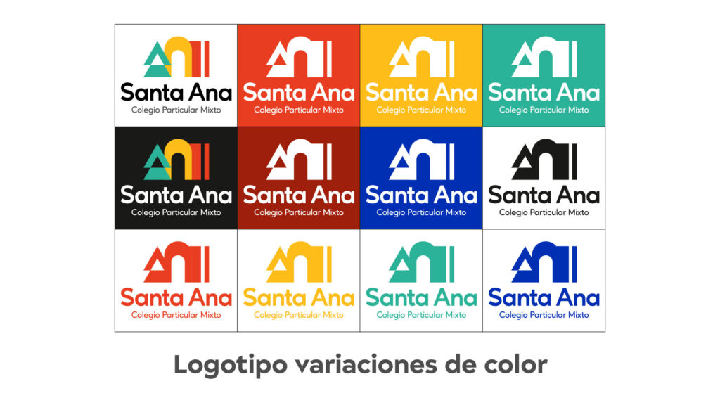
Logo design Santa Ana rebrand

Brand Board

Santa Ana Rebrand

Are you curious? Excellent! Click on the link to see the Brand Board I made for “Santa Ana”.

Santa Ana rebrand Brand Board
Website auto lathe mockup
Project
Rebranding and launch of the new Torno Auto website

Torno Auto es una rectificadora de motores en Chimaltenango, Guatemala con más de 25 años de trayectoria profesional como expertos en la rectificación de motores. Para posicionarse como la rectificadora de motores líder en Chimaltenango la marca necesitaba llevar a cabo un proceso de rebranding y desarrollo web que le permita tener presencia online.

Read More »
3D
UI Golden Talent

Interfaz de usuario y diseño web para un reclutador de talento con enfoque en servicios premium y candidatos especiales. El

Read More »
Brand Guidelines
REIJI: Brand identity and strategy (Branding)

REIJI is an emerging brand focused on the automotive market, specifically on the car-lovers niche in Peru. With the aim of positioning itself as a leader in the tuning and vehicle accessories market, a comprehensive branding and brand strategy process was carried out.

Read More »
0
    0
    your cart
    your cart is emptyReturn to the store