LOCKARGO (previously called Todologística) is a Peruvian logistics operator with 6 and a half years in the market and needed to change its name to something more positionable and renew its image to expand its client portfolio and highlight its logistics and transportation services, moving from land to international.
CLIENT
Todologistics (Now LOCKARGO)
SECTOR
Logistics and international freight transport
THE CHALLENGE
Transform Todologística's brand to reflect its international growth and professionalism, projecting reliability and experience in a competitive market.
WORK ROLE
Branding Specialist, Brand Strategist, Brand Identity Designer.
FUNCTIONS
In order to carry out this rebranding process, it was necessary to create a new identity that conveys trust, quality and personalized attention, which are key values for its target audience made up of SMEs in the import and export sector.
Angelo Prado, General Manager of Todologística, expressed how they were looking for a change of image that would demonstrate the solidity and experience of the company. The mission was clear: to project an identity that spoke of seriousness and confidence and the new international perspective of the brand, incorporating crucial elements in the logistics sector where there is an opportunity to stand out. A comprehensive rebranding was required that would not only capture the essence of the company but also position it as a leading and reliable brand.
Developing a new name
Brand identity renewal
Design of institutional material
“Our main service is land transport, but we want to change the perspective so that the main service is international transport.”
To carry out the naming process of Todologística and find the ideal name for the brand, it was decided to follow a linear process consisting of 5 key stages:
Visual summary of the process:
More than 500 brand names were collected that work in the logistics and freight transport industry in Peru. It was taken into account that in order to come up with a positionable name it was necessary to aim for something shorter and conceptually innovative than the competition.
Focusing on the specific industry (Logistics Operator), a brainstorming session was generated that resulted in more than 40 keywords. These words not only reflected the logistics industry but also incorporated words related to the company's values and unique value proposition.
This list was meticulously refined, eliminating options and improving others, until the selection was condensed to the 10 strongest names. This critical process ensured that only the most impactful and representative were considered for the next stage.
Of the 10 finalists, 5 solid and well-founded naming proposals were developed. Each was created to resonate with the target audience and to differentiate the company in the market.
A naming table was used to systematically evaluate the effectiveness of each proposed name. This analysis included categories such as phonetics, brevity, pronunciation, memorization, suggestiveness, graphic, uniqueness, registrability and whether its web domain was available for the brand giving a more reliable numerical score for choosing names.
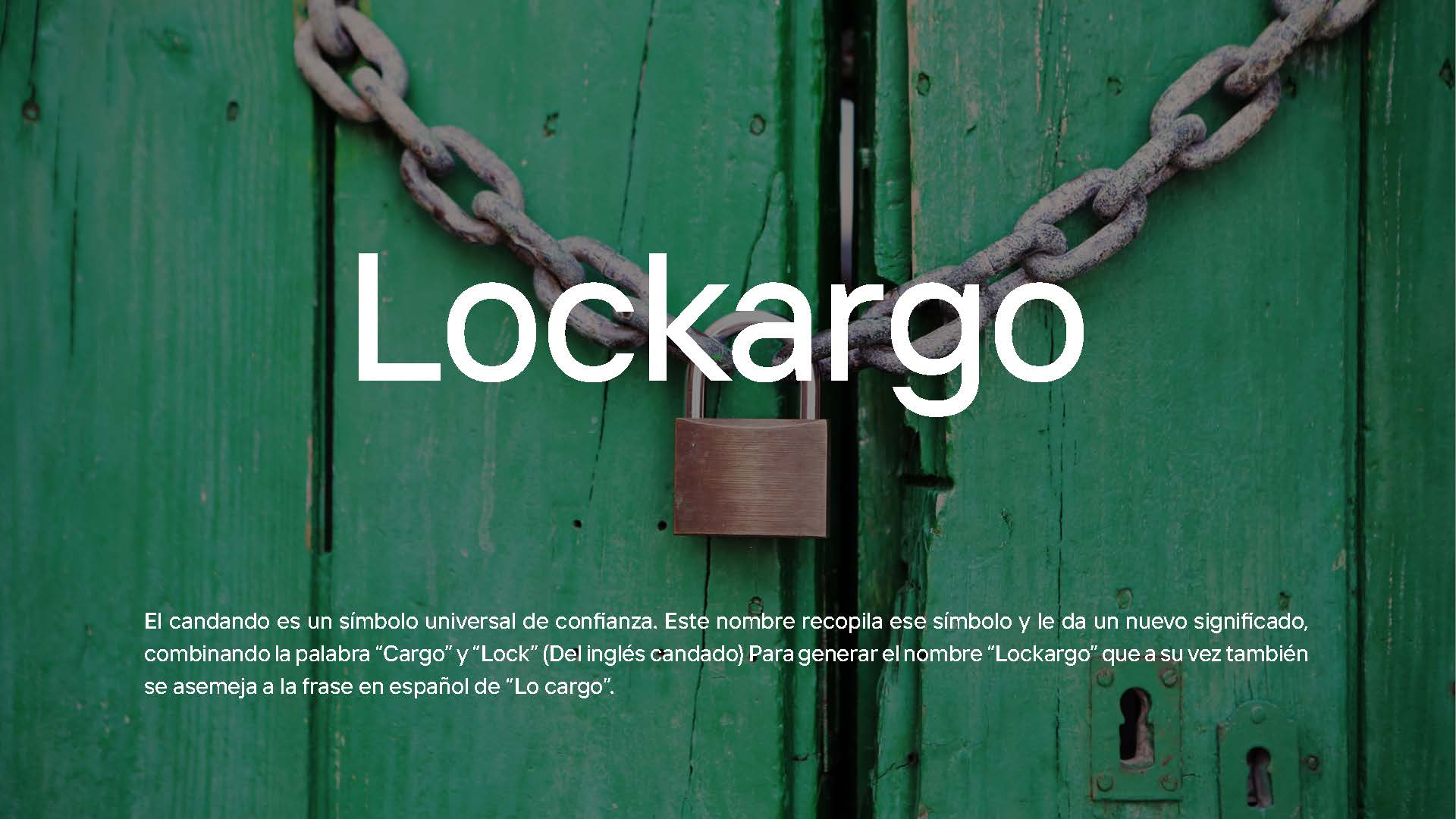
El nombre “Lockargo” ha es considerado un acierto en términos de branding por varias razones. Combina la palabra “Lock”, que representa seguridad, con “Cargo”, que se refiere directamente al transporte de mercancías. Este nombre transmite confianza y claridad, elementos esenciales en el ámbito logístico, y su similitud con “Lo cargo” en español refuerza su impacto en los mercados hispanohablantes. Es fácil de recordar y pronunciar, convirtiéndose así en una opción sólida y memorable para una marca que garantiza seguridad y confiabilidad en el transporte.
"The goal is to project an image of the brand as a professional and trustworthy company."
The rebranding process was meticulous and collaborative. Through strategic meetings and brand workshops, we worked closely with the current Lockargo team to capture the essence of what the brand stood for and aspired to be. We explored various creative ideas, through Stylescapes and concepts that would help generate a new visual identity that would connect with its target audience: small and medium-sized businesses looking for efficient and safe logistics services.
During the Lockargo rebrand, advanced creative techniques were used to develop a vision based on key values. Inspiravideo was used to generate innovative ideas and competitive benchmarks were analyzed to understand market trends. Additionally, similar cases were explored to gain a diverse perspective. These combined approaches resulted in the creation of unique visual styles that represented the brand as professional, friendly and modern. In this way, the new branding managed to connect with both the company’s mission and customer expectations in the global logistics space.
Analogous cases analyzed: https://www.behance.net/collection/201373323/International-transport
El diseño del logotipo de Lockargo se abordó con un proceso meticuloso y creativo que incluyó el ‘Brainswarming’, una técnica de generación de ideas basada en el comportamiento de las hormigas, permitiendo a los participantes aportar ideas en silencio mediante notas en un esquema estructurado. Se enfatizó la simplicidad, aspirando a un diseño distintivo que resaltara en blanco y negro y fuera fácilmente reconocible por su forma o contorno. Este enfoque minimalista garantiza versatilidad en diversos medios y reduce los costos de impresión y aplicación de marca. Además, se adoptó un enfoque de ‘pensar en pequeño’ para asegurar la adaptabilidad del logotipo en aplicaciones de menor tamaño, como etiquetas de ropa o favicons. El proceso también incluyó bocetaje tanto manual como digital, enfocado en comunicar los pilares de confianza, experiencia, profesionalismo y calidad de la marca
Concepts of logotypes that convey confidence, security and professionalism in national and international cargo and transport services were presented.
La primera propuesta las letras “L” y “O” del nombre “Lockargo” con la figura fondo de un avión de papel acompañado de un profesional tono de azul cielo. Esta propuesta transmite la profesionalidad de la marca y su transporte.
The second proposal combines a movement symbol with a padlock symbol that focuses on transmitting security accompanied by a friendly green color.
The third proposal combines the location symbol with the first initial letter of the brand name, using shades of sky blue to express the brand's security and confidence.
The proposals were evaluated and improved, and the third was chosen because it broadly encapsulated the brand's identity. However, to differentiate this proposal from competing brands in Peru such as Glovo, different color and symbology variations were explored to come up with a proposal of a paper airplane within a green location symbol that conveys the trust, security, speed and simplicity of the Lockargo brand.
El branding de Lockargo se centra en establecer una conexión emocional con sus clientes a través de la seguridad y la confianza, al tiempo que asegura una presencia visual profesional y consistente en todos los puntos de contacto. La identidad de la marca está cuidadosamente construida para ser reconocible y memorizable, facilitando así la construcción de una reputación sólida y confiable en el mercado global. El concepto detrás de la marca de Lockargo es representar una “Logística Global Profesional y Seria”, teniendo así el objetivo comunicacional de generar confianza y reflejar la experiencia y solidez de la empresa.
Lockargo’s logotype combines a location symbol with a paper airplane, evoking safe transportation and international connectivity. The design allows both text and symbol to work together or separately, providing flexibility in the brand’s usage. Lockargo has different logo variations that include slogans tailored to various messages and contexts, thus strengthening the brand’s effective communication. The logotype uses vector elements for its isotype and incorporates the use of the PP Agrandir typeface family, specifically in its Wide Black Italic variant. This ensures a sharp and professional presentation on all platforms where it is used.
Lockargo uses a selection of colours in its palette, with a primary focus on green to convey safety and global reach. It is also complemented by pure white tones to offer clarity and contrast. These colours are carefully chosen to maintain consistency across all applications of the brand. Lockargo uses different variations of its logotype to optimise visibility on various backgrounds, ensuring that the brand is recognisable and consistent in all situations.
Lockargo's logo design is intended to maintain its integrity across different sizes and contexts, recommending specific versions for use in large and small formats.
To communicate the brand, the Golos Text typeface was selected, with its different weights ranging from Regular to Black, providing legibility and a modern aesthetic. On the other hand, patterns were also used. Corporate patterns are a crucial element of branding. They serve to extend the brand's visual identity to a wide range of applications, both digital and physical, thus reinforcing the brand's presence at all points of contact with the customer.
Taking into account the new brand name, its new identity and guidelines to follow, efforts were focused on designing all the corporate material for the brand, which includes pieces such as a transportation rate sheet, an arrival notice, a shipping form, an import clearance proforma, a section for letters in their presentations, an email signature and a ribbon with a custom design for the boxes.
Lockargo’s strategic rebranding transformation has had a profound impact on the Peruvian logistics market. The new corporate image has increased the brand’s visibility, significantly improving its recognition, recall and perceived trust by customers. This change has not only strengthened Lockargo’s brand promise of providing safety and efficiency in cargo transportation, but has also positively boosted its business growth. The investment in a coherent identity and a carefully planned strategic branding approach has proven invaluable for the brand, leading Lockargo to reach new heights in the international logistics sector.
Freelance brand identity and UI/UX designer based in Guatemala, Oliver Puente helps companies modernize their brands.
Diseño Web: La combinación de estética y funcionalidad El diseño web no es solo cuestión…
Por qué las Landing Pages Son La Clave Para Multiplicar Tus Conversiones El mejor vendedor…
Branding en Guatemala. Un acercamiento y guía sobre como posicionar una nueva marca en el…
¿Cansad@ de invertir en publicidad y que no funcione? No te preocupes más, descubre en…
El auto layout en Figma llegó para quedarse, y si quieres ser un diseñador UI/UX…
El cansancio o fatiga extrema cuando eres diseñador gráfico es una situación de lo peor.…
Oliver Puente Digital Strategist and Designer with 5 years of experience in creating innovative digital brands and products. Specialized in Branding and Web Design (UI/UX) with certifications in Google Analytics, WordPress, and SEO. Committed to continuous learning and creating exceptional user experiences. Schedule a video call with Oliver P.