Rebranding for a Peruvian company
Deerlogistiks Rebranding
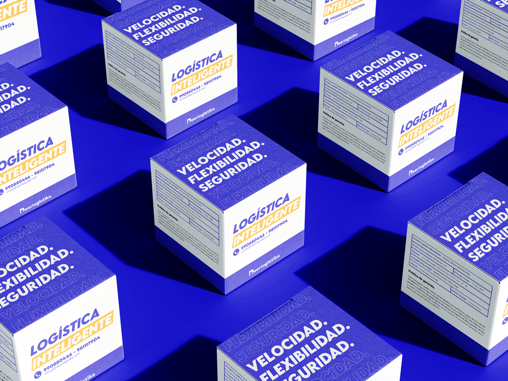
Rebrand for a Peruvian company of international import and export logistics operators, with a focus on customs procedures and heavy cargo with more than 14 years of experience in the market.

Table of Contents
The challenge:
The main objective of this project was to successfully change the "Peruvian Cargo Transport Service" brand with a more modern and relevant proposal that would allow the brand to be perceived as a more professional and safe option. The concept behind the creative direction of the project was “Safe and friendly logistics deer”.

The new logo design
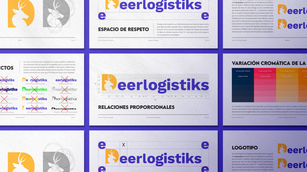
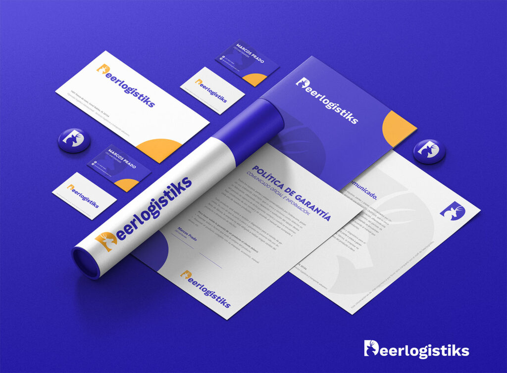
Deerlogistiks identity, which previously did not have a defined visual brand identity, needed to look more secure, friendly and logistical. Isometric shapes and a blue and gold color palette were used to make the brand a much more visually appealing option in the market. . The logo combines the letter “D” for Deerlogistiks and the side view of a classic deer.
About the new name
The old name "Peruvian Transport Cargo Service S.A.C" had a serious problem. Their customers could not memorize the name of the brand, they could only memorize the name of the person who served them. This is because the business name was too long for customers to easily memorize. I created a shorter version, using the symbolic part of the deer's long history and the company's 14-year culture and values.

The word "deer"
DeerLogistiks translates as “Deer Logistics”, but also the word “deer” sounds like the word “Dear”, the name could translate to “dear logistics” and it is a clever play on words. The advantage of this name is that the "Deer" represents "speed and kindness" something that ideally connects with the company.

The deer as a symbol
The Romans and the Hellenes spoke of the mystical character of the Deer, which knew how to distinguish the different species of healing plants, due to its perfect intuition and enlightening character.
It was considered a symbolic animal par excellence, for its agility and beauty.
In China, if you also add abundant antlers to the deer design, it will be a symbol of prosperity.

"For the classics, the Deer was consecrated to the goddess Artemis, protector of plant energy, and to Diana the huntress."


“Deerlogistiks brand identity design evokes a perception of a masculine brand, friendly and confident to work with customers, without being too corporate and boring.” -Oliver Puente

Brand Guidelines
Deerlogistiks Rebranding
Are you curious? Excellent! Click on the link to see the brand manual or brand book that I made for DeerLogistiks.

Oliver Puente

PrestaAuto Branding and web development
Branding e identidad visual para una agencia de préstamo de valores que utiliza su vehículo como garantía. Prestaauto es una

UI Golden Talent
Interfaz de usuario y diseño web para un reclutador de talento con enfoque en servicios premium y candidatos especiales. El

REIJI: Brand identity and strategy (Branding)
REIJI is an emerging brand focused on the automotive market, specifically on the car-lovers niche in Peru. With the aim of positioning itself as a leader in the tuning and vehicle accessories market, a comprehensive branding and brand strategy process was carried out.


