


Brand Guidelines
REIJI: Brand identity and strategy (Branding)
REIJI is an emerging brand focused on the automotive market, specifically on the car-lovers niche in Peru. With the aim of positioning itself as a leader in the tuning and vehicle accessories market, a comprehensive branding and brand strategy process was carried out.
Branding
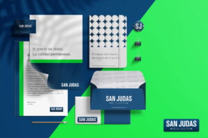
San Judas Rebranding
La Hojalatería San Judas es una Ferretería y Hojalatería con una trayectoria de 60 años en el mercado. El objetivo

3D
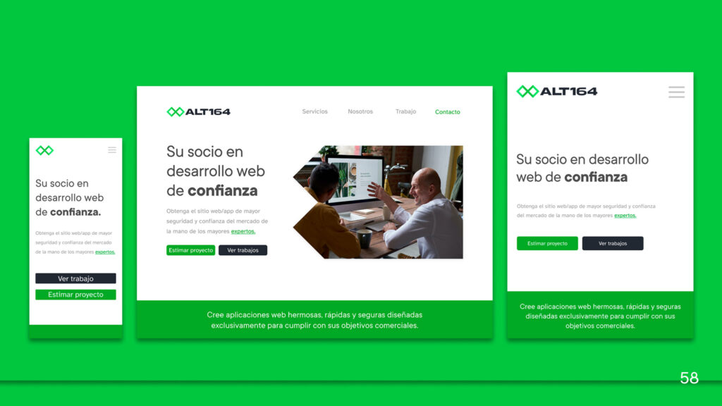
UI Golden Talent
Interfaz de usuario y diseño web para un reclutador de talento con enfoque en servicios premium y candidatos especiales. El